Figma File Organization
How we deal with Figma files at work

I had been working on this project (a new ERP for construction companies) for about a year when I had to stop and address some issues with Figma’s project and file organization. The team had been scaling up in a significant way and our (pretty anarchic) initial approach wasn’t working anymore. The size of the files was making them difficult to manage for people with slower machines, and finding the right design for something was becoming a challenge for stakeholders. It was time to work on our file organization.
Team and project organization
The first thing to know is that our projects are structured in a pretty classic way, as described in this article. We have an umbrella organization with a couple of workspaces, and inside each workspace, we have several teams (one per line of business). Each team manages a limited amount of projects, but what defines a project is not always the same. Some of the projects are products, and some others are internal initiatives, but we all have access to them and we can contribute when needed.
What’s a file for?
And then we have the files. Instead of having a big file that included all the designs for a functional area of our web app, I thought it would be better to create one file per user story. A little bit of background here. Like most modern software companies, we follow Agile methodologies to organize our work, and user stories are how we assign tasks to the different members of the team. By sticking to these user stories, we reduce the scope of the Figma file and we also create a consistency between the content of the story in our tracking system and what you find in Figma. So if a stakeholder wants to see the designs for the story 894512, they just have to open the Figma file with the same story ID in the title.
So what happens when we need to demo a feature or capability that includes many user stories? Well, for those types of things, we have epic files that copy the designs from different stories and put them together so we can show how the feature works. These files can also be turned into click-through prototypes when needed.
And what’s inside a file?
Every file has 3 presentation pages, a sandbox page, and other pages for the designs we need to hand off.
Presentation pages
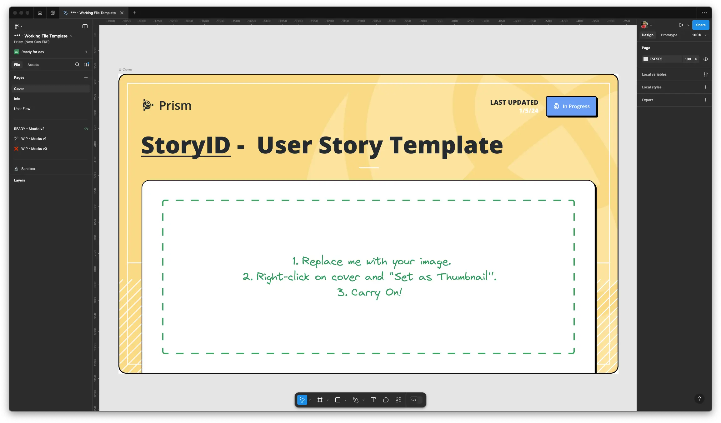
The first page is always a cover, something very common. This includes the title of the file (Story ID - Name of the story), the status of the file (Done, In Progress, On Hold), a ‘last updated’ date and a screenshot of a key screen.

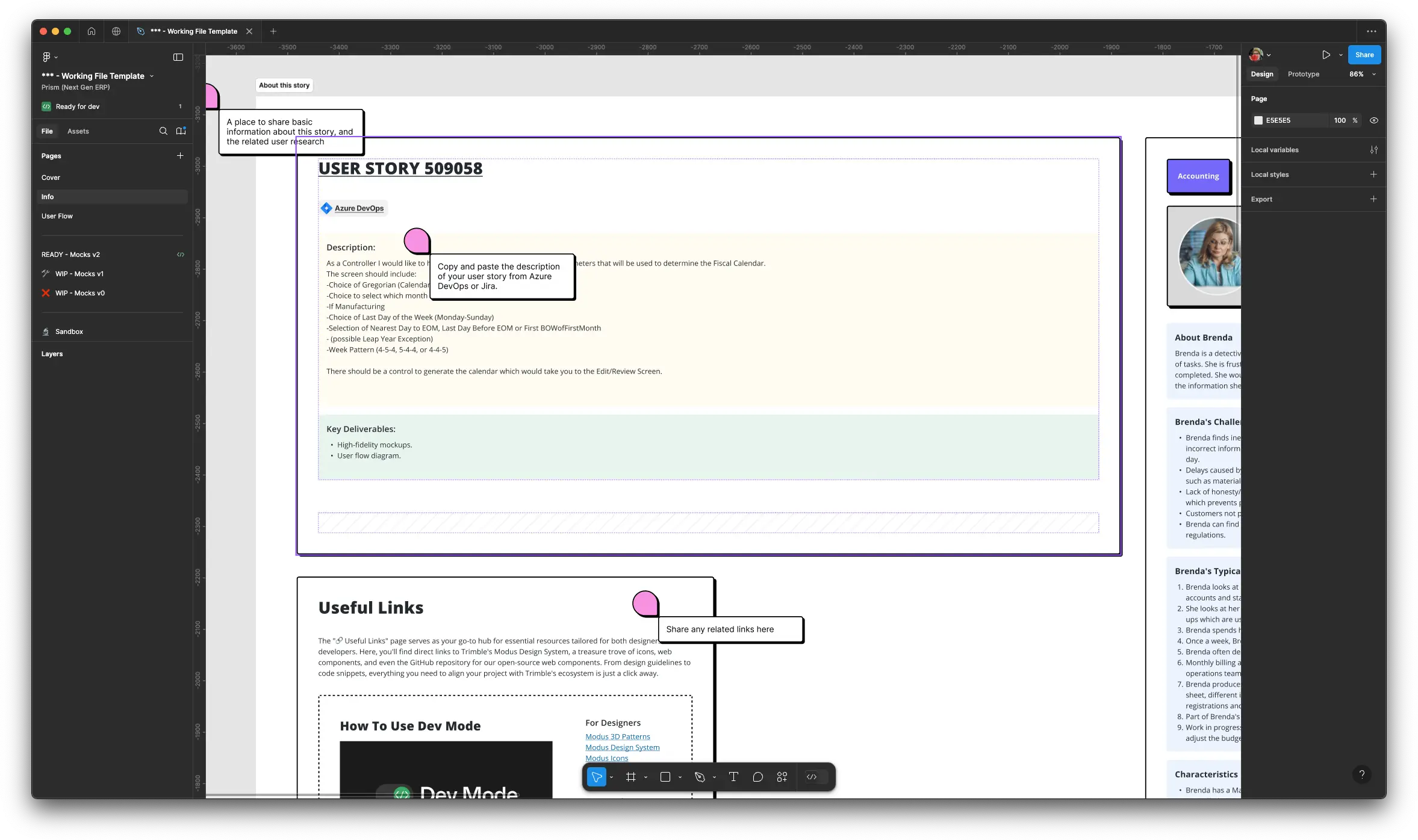
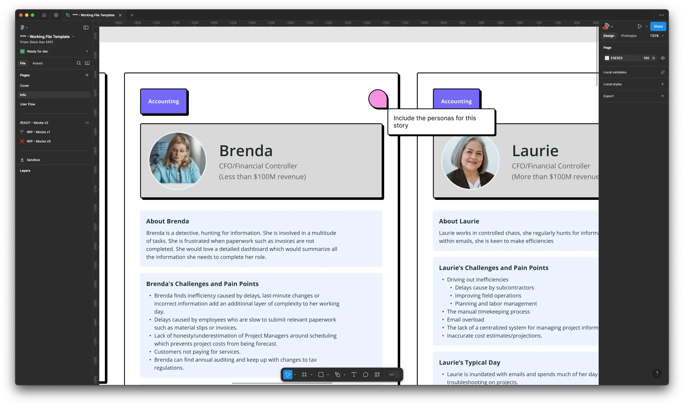
The second page is a bit more interesting. This is an info page where we include all the contextual information needed to understand what’s in the file. We have cards with the contents of the user story, all the user personas affected by this design, a list of useful links for developers, and an Information Architecture map that represents our product, with a pin of where these designs belong in that map.


And then we have a third page where we show any user flow diagrams relevant to that story. We don’t always need this for every story but it’s nice to have.
Design pages
Figma offers branching capabilities (think of a simplified Git but applied to design files), but this is something I haven’t been able to use successfully with stakeholders, so I use a more traditional way of keeping track of design iterations: versions. I know, I know, let me explain.
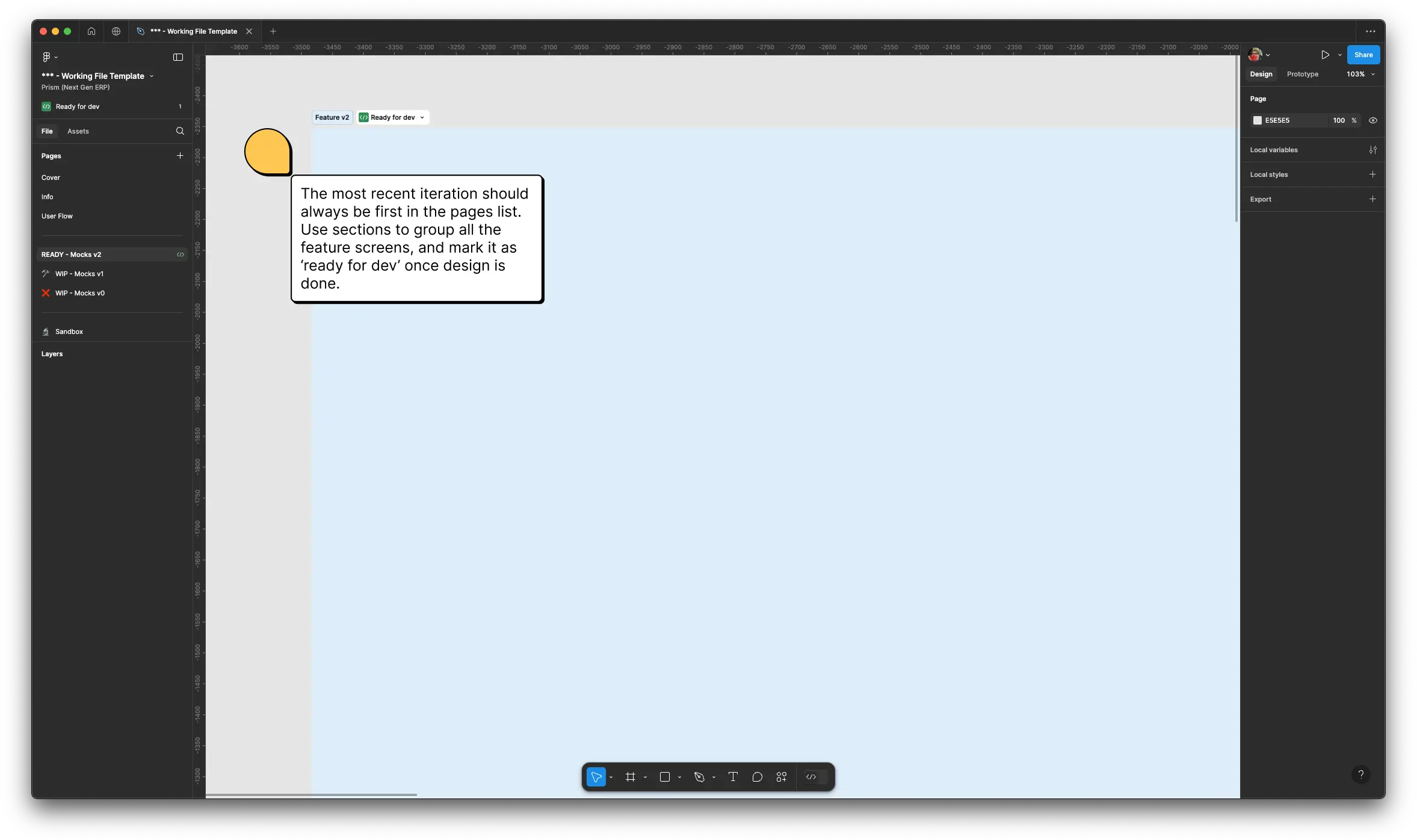
I always start with a page that I call “WIP - Wires (or Mocks) v1”. Then I normally get feedback from other designers and stakeholders that I apply to the designs if it makes sense. But if there’s a significant change of direction in the design, I leave that page alone and start a new design on a different page, “WIP - Wires v2”. And then I get feedback again and the process repeats… until we get to “READY - Wires vN”. Since the scope of the design is limited, this doesn’t happen 20 times, normally after 2 or 3 iterations we get to a solution that we are all comfortable with. Sometimes, that solution is tested with users, and with that feedback we’ll create another version of the design, but it will all depend on the type of user story.

And what about the ideas or experimentation that don’t fit in any of those design pages? Well, for those things we have the Sandbox page, where the designer can go wild and try different things before going back to the regular design pages.
But does this all work?
This started as an experiment in mid-2023, and so far it’s been working for me and my team. We have now three designers, one researcher, two product managers, and many many developers, and we all use this system. It might need some tweaks with time, but it has helped us communicate better with stakeholders, and in my book, that’s a win.