Building a component library in Sketch

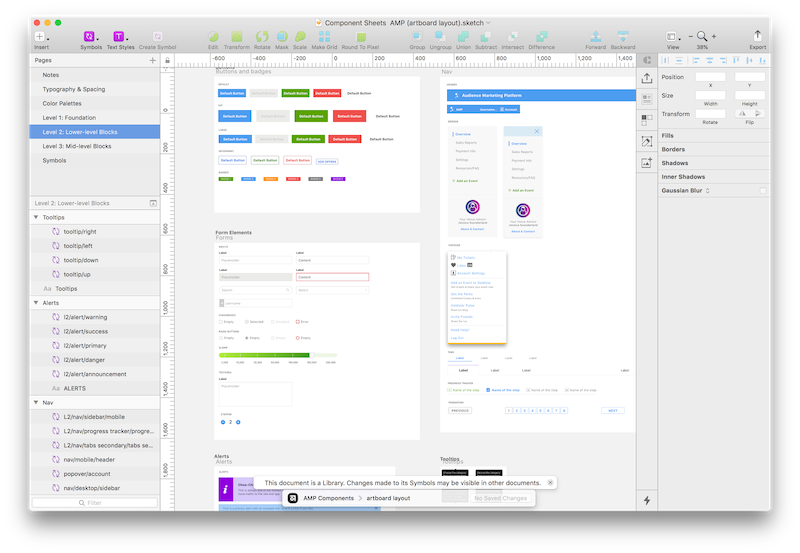
At Goldstar, we’ve been developing our own design system for the last few months and I can tell you it’s been a lot of fun. A design system is a collection of reusable UI components, guided by some rules, that can be assembled together in order to build new interfaces. We use a set of component libraries for Sketch in order to create, store and reuse this system, and I’ve been involved in creating the first one of these libraries. Note: Sketch calls its reusable componentes “Symbols”.
And how does this work? Well, these UI components work like building blocks; we categorize our components in different levels and each level builds off the one that precedes it. It’s an approach that borrows heavily from Atomic Design principles, but I’ll talk a bit more about this architecture later.
And why Sketch? It’s been our preferred design tool for the last 4 years and we like its plugin ecosystem and how it works with other tools like Abstract (for version control) or InVision (light prototyping, feedback, handoff). We are always exploring new alternatives, but we have invested a lot of time building these libraries and I don’t think we’re going to be migrating to other design tools like Figma or Adobe XD anytime soon.
The design team decided that we would have separate component libraries for each product and we would start by building the one for our B2B marketing platform. This product is smaller than our consumer site and it’s perfect for testing the new libraries architecture, naming conventions, etc. My job was to build this first library and find the best way to put together everything using Sketch.
Type of components
Each component library is arranged in levels like this:
- Primitives: This includes colors, gradients, patterns, and spacers. We thought about including here text styles, but we ended up managing them separately.
- Level 1 / Foundation: The foundation level includes components that can’t be broken down any further. These are very basic building blocks of our products. As such, they can’t contain nested components and overrides should be minimal. An example of foundational components are logos and avatars.
- Level 2 / Lower-level blocks: These are typically composed of a combination of primitives and level 1 components. Some UI elements included here are buttons and form elements.
- Level 3 / Mid-level blocks: Mid-level blocks are typically composed of a combination of primitives, level 1 and level 2 components. Modal windows, tables, and cards are all part of this level.
- Level 4 / Full composition: These elements are used mostly for demo purposes. They are full-screen compositions that include all other level components and primitives.
- And we also have separate text and layer styles. We have text styles available in multiple weights, colors and alignments. The layer styles include predefined colors, gradients, form container states and button states. These all help create more flexible components in Sketch.

Naming things
It was important to put in place some naming conventions that reflected our component architecture. We ended up using this:
Level / Type of component / Component name / State or Pieces
And an example would be:
L2/nav/breadcrumbs/_pieces/link
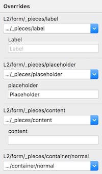
Keeping a consistent naming across components is also important because Sketch uses this names in order to arrange them in menus and in order to display the right component overrides when you use these components. You can use these overrides to customize your components with different nested elements, making them a lot more powerful and flexible.

Maintenance and updates
So once we had the first of our component libraries ready we had to create a protocol in order to add or modify these components. Keep in mind that modifying these components in the master library will affect any design file using this library. You could easily break things, this is kind of a big deal!
First of all, the designer needs to decide if a new component is necessary. Is this new component going to be reused? If the answer is no, you can detach the original Sketch symbol and call it a day. But if the new variation or pattern is likely to be reused, then it might be time to create a new component.
The new component should follow some rules:
- It needs to follow our naming conventions.
- It should use nested components when it’s possible. The designer should try to organize the layers in a hierarchical way so the overrides panel in Sketch makes sense, make the layer names semantic and remember that color and icon symbols are good helpers.
- It should be responsive so it can be resized without breaking it.
When the new component is ready, it’s time to share it with the team before it’s merged in the component library. We use Abstract for version control of our files and libraries and the workflow here is very similar to git: create a branch, add your new stuff, commit your changes, ask for feedback and if the symbol gets approved then merge your branch.
Things I learned
The most exciting part of this project is that we were not just documenting some UI components, we were creating a new workflow for an entire team. There was a lot of trial and error in the process and I found some Sketch bugs (setting resizing constraints in nested symbols is definitely tricky) but this first library was quickly adopted by the entire team and we ended up creating additional libraries for our consumer site, newsletters and wireframes.